 Dedicated FREE FOREX VPS
 Free FOREX Virtual Private Server
 MT4 Demo Contest, Get $500
 Sign Up for an Account, Claim 60% Deposit Bonus
 Free MT4/MT5 VPS 2024
 Send E-mail and Get Free Merchandise
 $1K Refer a Friend Bonus for Pepperstone Pro clients
 Maximize Your Earnings with 100% Deposit bonus
 Trade to Win, $5,000 Monthly Demo Contest
 Claim 30% + 15% Deposit Bonus from LiteFinance
Charts and price movement are a big part of trading. What is the easy way to master trading charts for beginners?
The ability to read charts is a fundamental skill every trader should have. It's very rare for a forex trader to trade solely by looking at a series of numbers in a table. Learning trading charts is easier than you think.
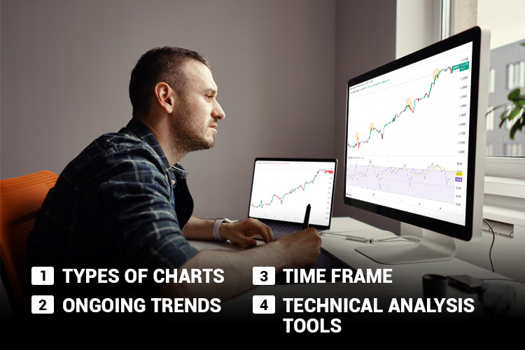
Here are 4 simple keys to mastering trading charts:
- Understand the types of charts: There are line charts, bar charts, and candlesticks.
- Determine ongoing trends: Develop skills to recognize and analyze continuous trends.
- Learn how time frame works: The smaller it is, the faster the price movement.
- Utilize technical analysis tools: There are overlay and oscillator indicators to help you analyze the chart.
If you master how to read trading charts, you'll find it easier to see patterns in price movements. So, let's take a look at the following trading chart guide!
1. Understand the Types of Charts
There are three types of charts available on a trading platform. First, there is a line chart or a straight line that connects closing prices.
Second, is a bar chart, a vertical line showing the opening, closing, highest, and lowest prices (OHLC chart).
Third, there is a candlestick chart that provides the same information as a bar chart but with a better visualization. Here is a description of each type of chart to help you understand them better:
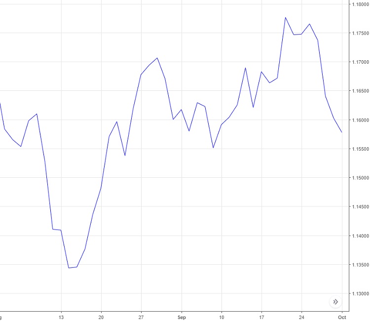
Line Chart
A line chart is the simplest type of chart. This chart is formed by drawing a line from one closing price to the next closing price. If they are connected continuously, it will look like the image below.
Bar Chart
If the line chart only includes closing price information (Close), the bar chart already includes the opening price (Open) as well as the dynamics of the highest price (High) and the lowest price (Low).
Therefore, this chart is often called the OHLC (Open, High, Low, Close). An example of a bar chart is as follows:
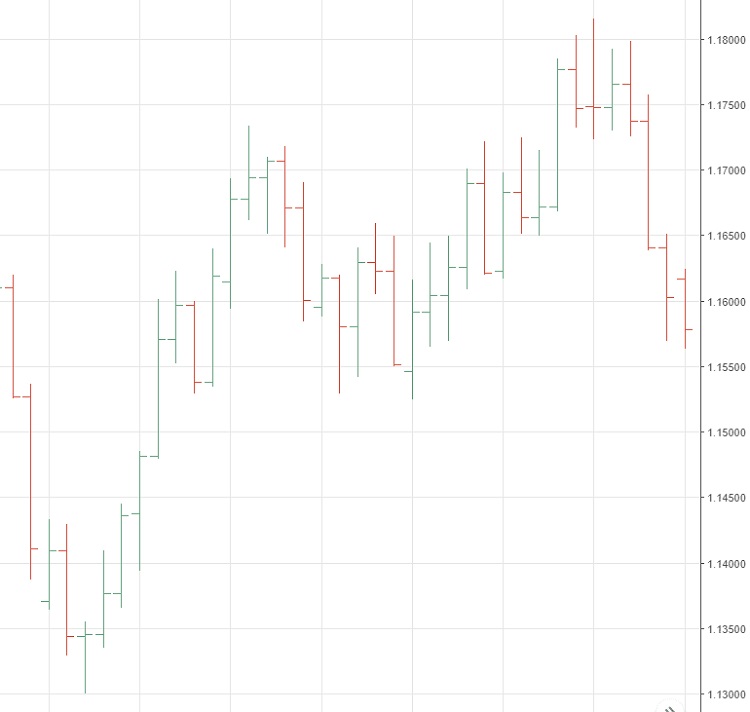
In the image above, the markings on the left side of the bar indicate the opening price, while on the right is the closing price. The bottom of the bar indicates the lowest price, while the top is the highest price.
These prices occur within a certain time frame according to your chosen time frame. It can be 5 minutes, 10 minutes, 1 hour, one day, or even one month.
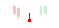
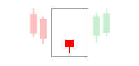
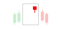
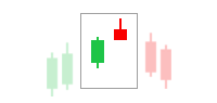
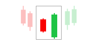
Candlestick
Candlestick is a forex chart that includes OHLC price information, just like a bar chart, but in a more visually appealing format.
Here, OHLC is depicted as a candle with a wick made from High and Low. Meanwhile, the candle's body indicates the price difference between Open and Close.
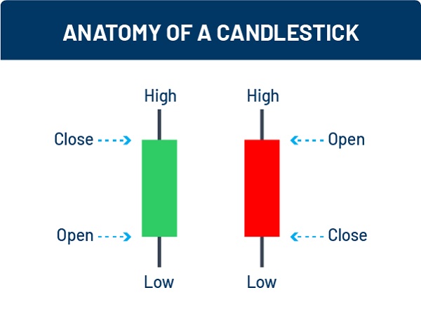
There is a decrease if the Open price is higher than the Close price. Conversely, if the Open price is lower than the Close price, it means there is an increase in price over some time.
The color of these candlesticks can be changed according to preferences. However, most traders prefer to use green and red colors. Well, on the trading platform, the candlestick chart will appear more or less like this:
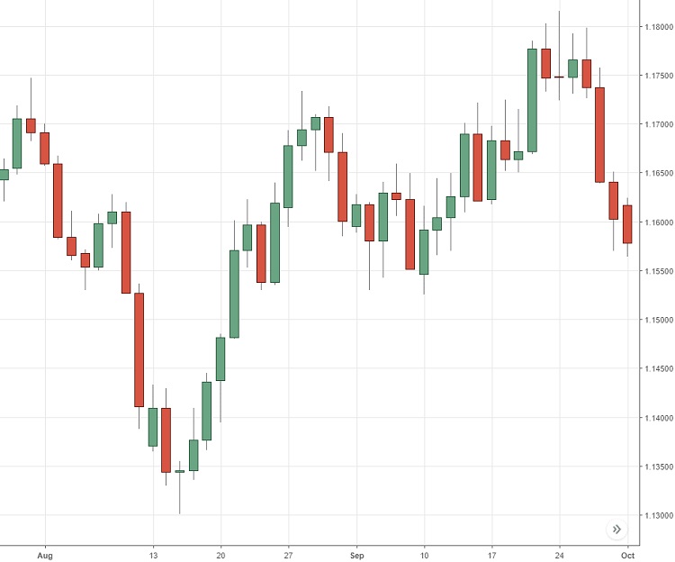
Of the three charts above, almost all traders today prefer candlestick charts because of their completeness of information and ease of interpretation.
2. Determine Ongoing Trends
To open a buy position, you must ensure that the chart trends upwards. In other words, the profitable trend is an uptrend. But what exactly is a forex trend?
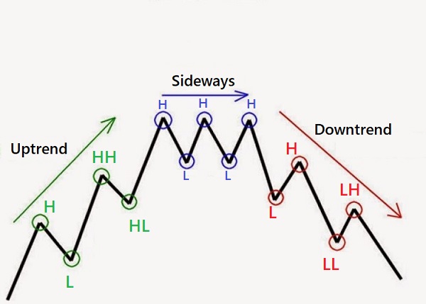
A trend in forex trading is a movement that indicates the direction of a currency's price in the forex market. This movement does not take the form of a straight diagonal line in one direction.
Typically, the market moves in a series of zigzag lines. If a currency is in demand, its chart will gradually zigzag upwards. If it is falling, the trend chart will zigzag downwards.
The zigzag movement in an uptrend forms a series of successive waves with clear peaks High (H), Higher High (HH), Low (L), and higher troughs Higher Low (HL). Meanwhile, a downtrend is usually formed by High (H), Lower High (LH), Low (L), and Lower Low (LL).
In short, three types of trends in forex are characterized by the following characteristics:
- Uptrend, when the chart shows a gradual upward movement of prices.
- Downtrend, when the chart shows a gradual downward movement of prices.
- Sideways or Ranging, when the price shows consolidation due to the tug of war between sellers and buyers.
3. Learn How Time Frame Works
The next trading chart guide is to pay attention to the time frame. Do you know what a time frame is? Yes, a time frame is a specific period determined as the observation period for price movements.
In MetaTrader, the units of the time frame that can be ed are 1 minute (M1), 5 minutes (M5), 15 minutes (M15), 30 minutes (M30), 1 hour (H1), 4 hours (H4), one day (D1), one week (W1), and one month (MN).
It should be noted that each time frame can generate different interpretations of pair movements. For example, if you open the EUR/USD time frame on H1, the price movement may not be the same as in the D1 time frame. Why?
The 1-hour trading chart (H1) consists of candles formed every 1 hour, while the 1-day trading chart (D1) consists of candles formed every one day.
The H1 chart has faster movements, but its trend is short-term. Meanwhile, the D1 trading chart does move slowly, but it summarizes the actual trend in the market. The difference is clear.
So, which time frame should you choose?
There is no specific way to choose a trading time frame. You only need to adjust the time frame to the trading strategy used.
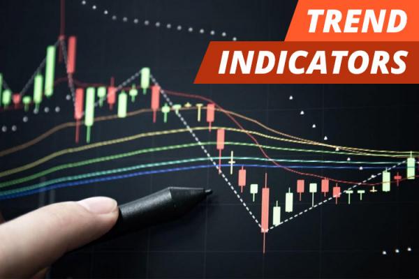
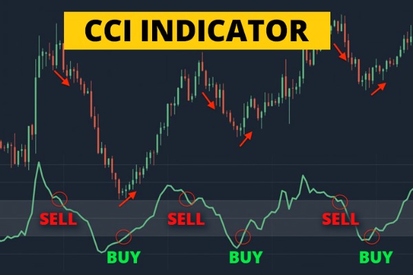
4. Utilize Technical Analysis Tools
Technical analysis tools on the chart are created based on mathematical calculations on prices, volumes, or market interest. These tools are commonly referred to as technical indicators.
Applying technical indicators to price charts lets you map market conditions to predict the next price movements. So you can identify the best moments to buy or sell.
From their appearance, technical indicators are divided into two types, Overlay and Oscillator.
Overlay Indicators
Overlay-type technical indicators usually take the form of a graph that is used by overlaying it on top of the price chart. Examples of the most commonly used Overlay-type technical indicators are:
- Moving Averages (MA)
- Bollinger Bands (BB)
- Parabolic SAR
- Ichimoku Kinko Hyo
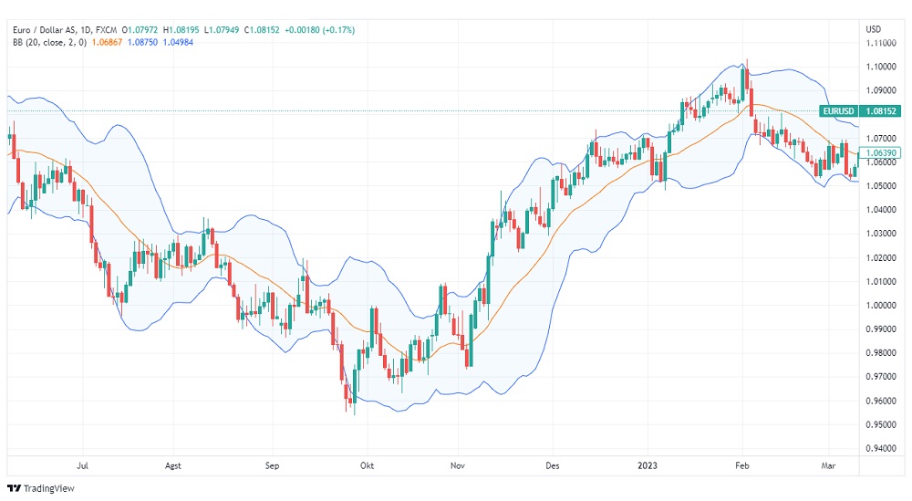
The image above is an example of the EUR/USD chart display with Bollinger Bands. The candlestick chart represents price movements, while the blue and yellow lines display the Bollinger Bands.
Oscillator Indicators
Oscillator-type technical indicators usually display oscillations between certain minimum and maximum values that appear below the price chart.
In addition, Oscillator-type indicators also consider trading volume fluctuations, which are different from Overlay indicators, mainly calculated from price data. Some examples of the most famous Oscillator-type indicators are:
- Moving Average Convergence Divergence (MACD)
- Relative Strength Index (RSI)
- Stochastic Oscillator
- Money Flow Index
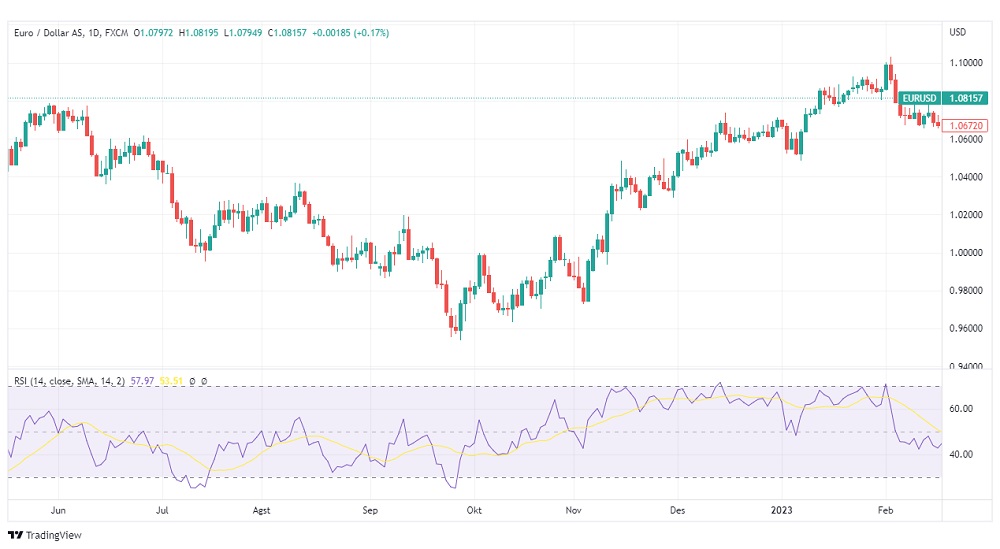
The image above is an example of Oscillator-type RSI indicator on the EUR/USD chart. You can see that the purple line below the chart is the RSI indicator.
Usually, traders often use more than one technical indicator to analyze prices. For novice traders, it is better to learn one by one of the available indicators first, then choose the most comfortable and profitable.
It is important to note that you should never try new technical indicators on a real account. If you are still learning, use a demo account to be freer to trial and error.
Those are the 4 important points from the beginner's chart trading guide. It's clearer now. Understanding the contents of chart trading is a basic skill every trader must have. You can get a lot of valuable information for forex trading from the chart.
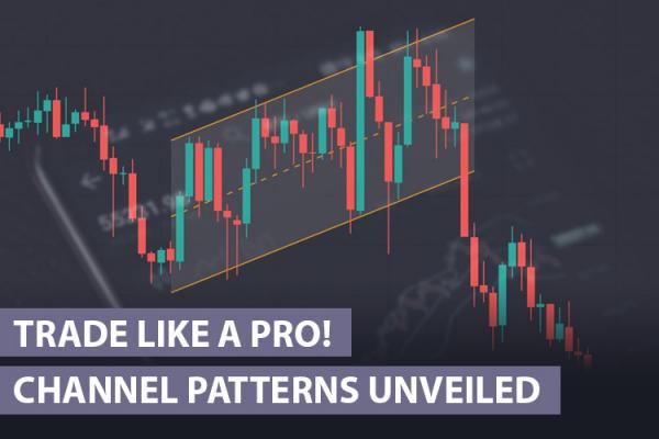
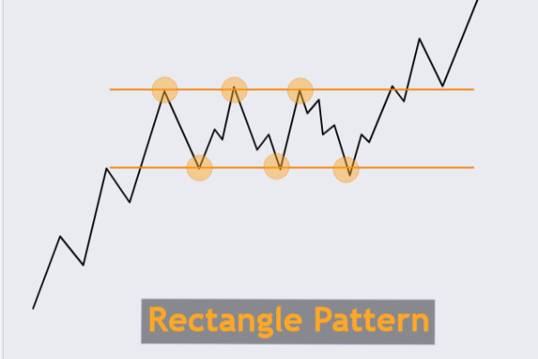
Once you understand the basics of charts, it will be easier to analyze the markets. Sometimes, charts will form certain patterns that give the traders different signals. What kind of patterns often emerge on the charts?